

Mattress retail · A/B testing
Mancini's Sleepworld
Sleep on it. Then test it.
Mancini's Sleepworld has been helping California sleep better since 1969, from a family business in the Bay Area to a chain of showrooms across Northern California, with free next-day delivery and a 365-night comfort guarantee. Online, sleepworld.com has to do what a good salesperson does on the showroom floor: help someone choose the right mattress with confidence. Pivotal runs its experimentation programme, designing, building and testing every change on live traffic, and measuring it against revenue before anything ships.
- Experiments run
- 35
- Shoppers reaching checkout
- +27%
- Visits to category pages
- +24%
Results for Mancini's Sleepworld: 35 experiments run; +27% shoppers reaching checkout; +24% visits to category pages.
“We've seen great improvements. The conversion rates have improved, and I believe a lot of it is because of the adjustments that we've been doing all this year.”
Mancini's Sleepworld
The Opportunity
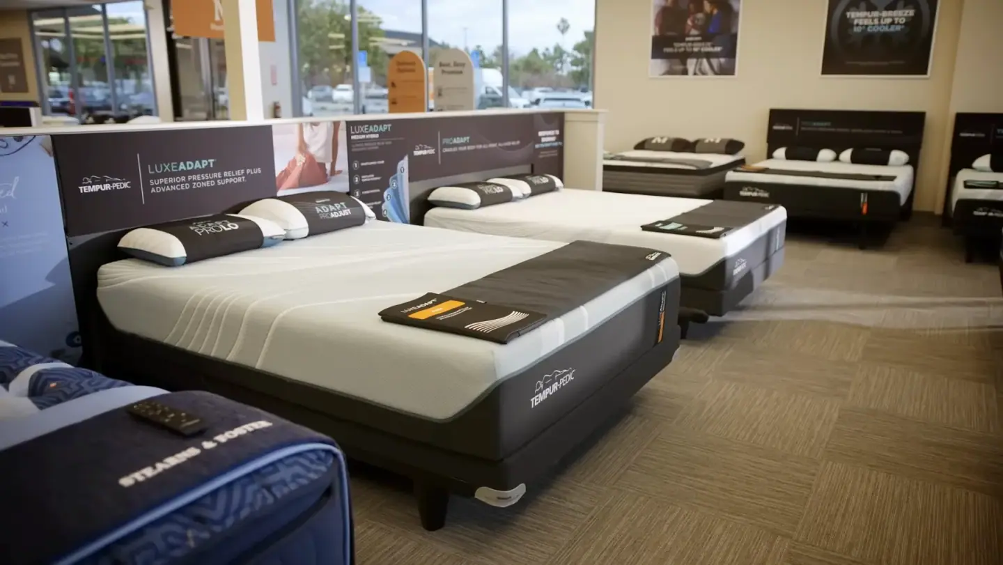
In a showroom you can lie down on a mattress. On a screen, every mattress is a white rectangle, and the differences that matter, firmness, materials, feel and price, have to be explained rather than felt. Shoppers on sleepworld.com were falling away between the category pages and the product pages, and again at checkout.
Mancini's didn't want a redesign built on opinion. It wanted to know which changes would genuinely help people choose, and to prove it with real customers before committing its own developers to building anything.

The Solution
A testing programme, not a wish list. Each idea starts with evidence: heatmaps, click maps and the funnel itself show where shoppers hesitate. We design the change, Mancini's team comments on it in Figma, and our developers build it as a test, QA'd on every device before Mancini's checks it from a preview link.
Measured where it matters. Every test runs on live traffic and is judged on how far shoppers get through the funnel and on GA4 revenue and order value, not on clicks alone. We review results with Mancini's team every couple of weeks.
Winners ship immediately. A winning variation goes to all traffic straight away, while Mancini's developers build it into the site from our designs and developer notes. Ahead of big sale weekends, checkout is tested end to end, and anything in doubt is rolled back first and discussed after.
The Tests
The home page, with an expert's eye. A redesign that put Mancini's own sleep experts and their picks up front sent 24% more desktop visitors on to the category pages.
Filters that close. Listing pages that showed only the most-used filter options, with the rest a tap away, lifted add-to-cart by 17% and the number of shoppers reaching checkout by 27%.
Product pages that lead with the product. Moving the details people need above the upsells lifted add-to-cart by 37% on desktop.
And the details in between. An image-led menu that sends far more shoppers into the right sub-category, delivery dates in the mini-cart, social proof at checkout, and a mattress-protector offer in the mini-cart that moved 21% more shoppers through the next step of checkout.
The Results
A year in, sleepworld.com is a site shaped by its customers' behaviour rather than by guesswork. The winning changes run across the home page, navigation, listings, product pages, mini-cart and checkout, each one proven on live traffic before Mancini's developers built it in, and every losing idea was retired before it cost a day of development. Mancini's has seen its conversion rates improve across the year, and the programme carries on with a pipeline of new tests, from a product-finder quiz to shopping by sleep concern.